Industrial facilities such as factories, oil & gass rigs or
chemical plants have countless documents to keep them operational.
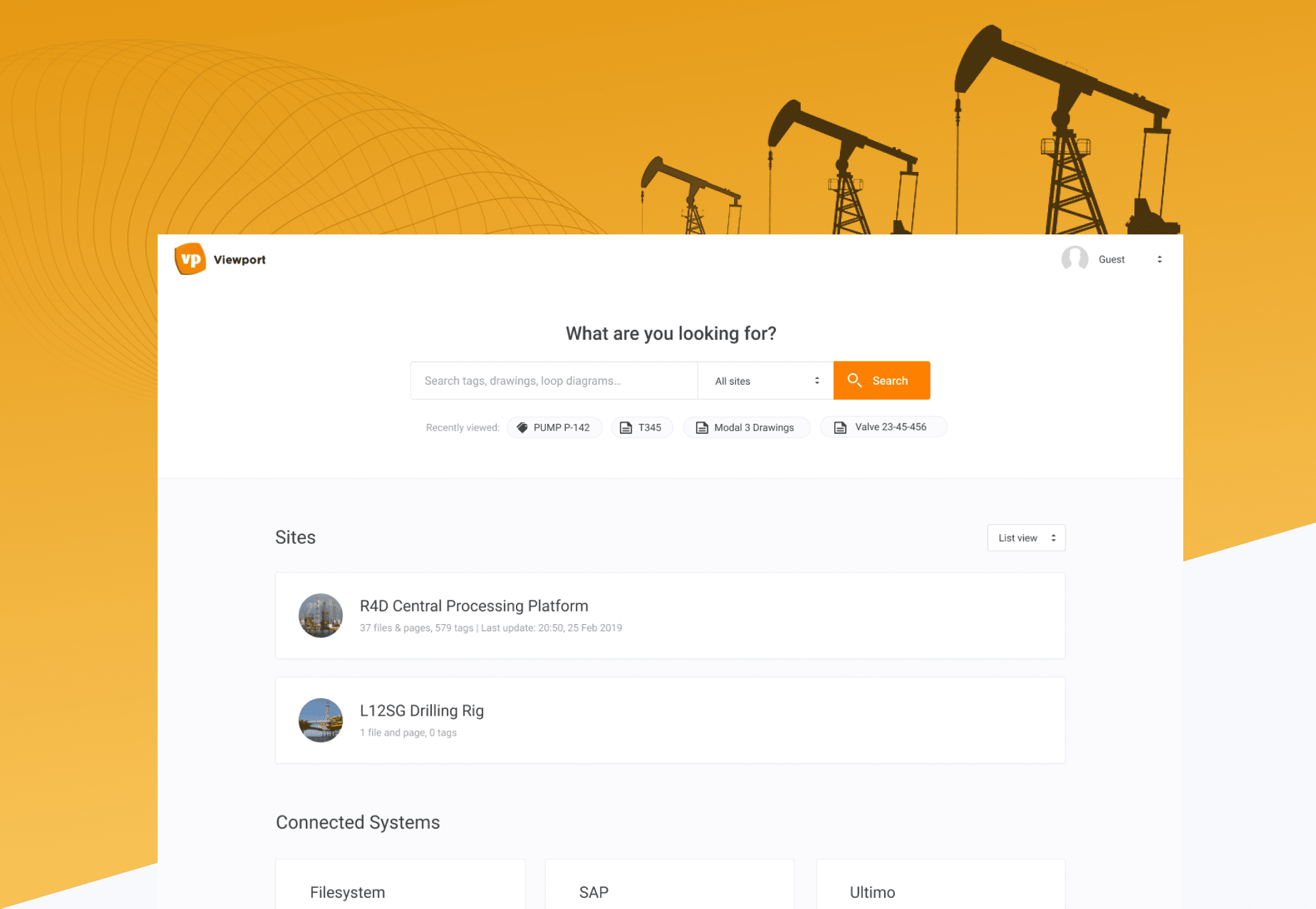
Viewport is an AI based information portal that links
all these technical documents and makes searching them a breeze.
In this case study we will focus on the design of
their cloud solution.
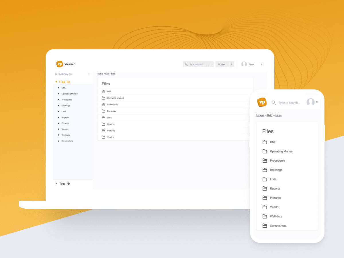
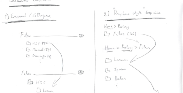
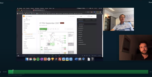
Navigating the redesigned file structure felt pleasant and effortless. I hope we get the updated product soon!

Viewport's main offering is based on a so called fat client which is a server on-site of these facilities. This makes updating and maintaining it cumbersome. Also, the interface felt dated and was due for a redesign.
Design a new cloud-based solution with a fresh design language that supports future growth of the company. Setup a styleguide for the in-house development team.
Worked as solo researcher / designer during 9 months for about 1 day per week. Next to design, I was responsible for setting up appointments with Viewport's clients and doing moderated usertesting.
Tested multiple users on 2 industrial sites in the Netherlands which served as input for the new cloud solution. After delivery, development was done by Viewport's in-house product team.
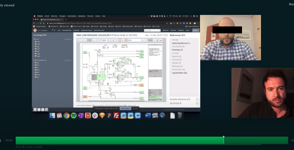
During the first set of user tests, I observed how the old interface was used for top tasks & scenarios according to my interview with the CEO.
In the second set of user tests, I did the same test plus I collected feedback on the first UX iterations with an A/B test setup.
A basic design system / style guide for the
Viewport development team was created so new features could be
developed without relying on a designer.
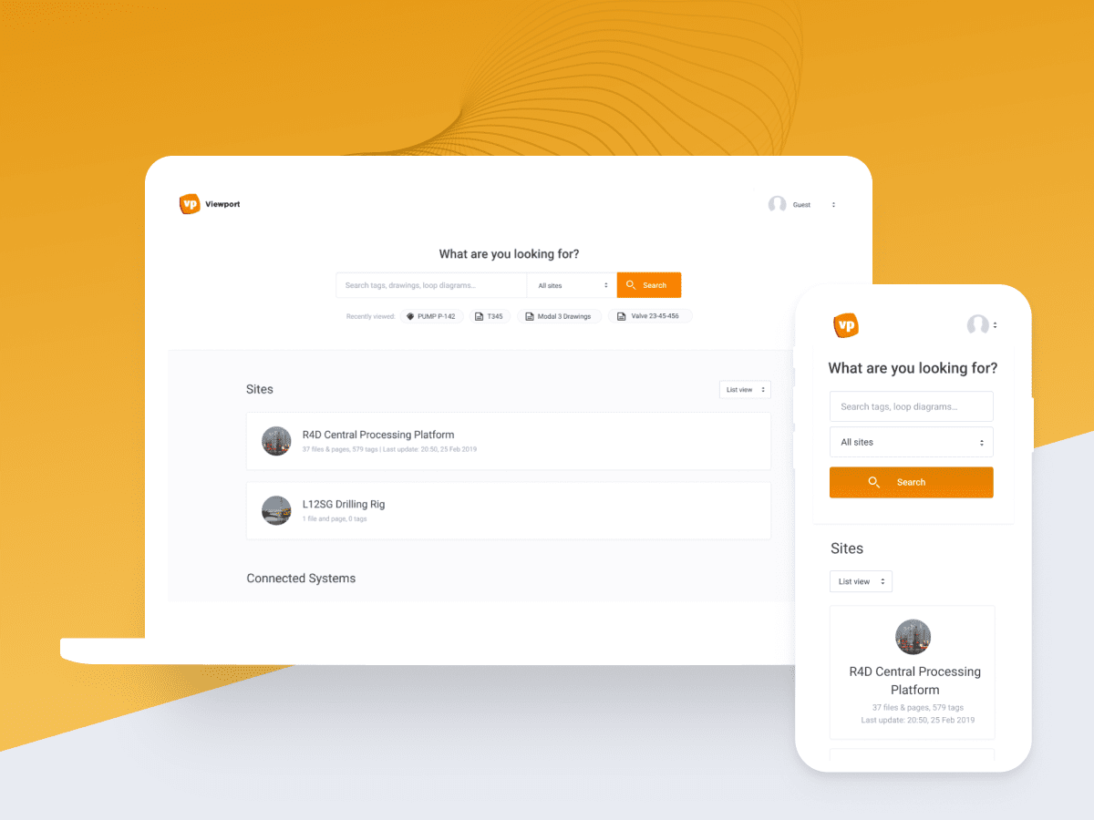
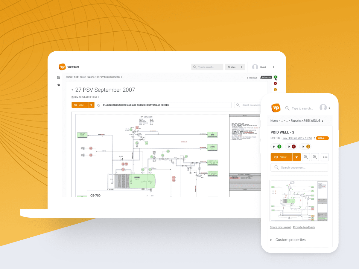
Mobile states
were also specified in detail as the file browser navigation logic
differed slightly compared to the desktop state.
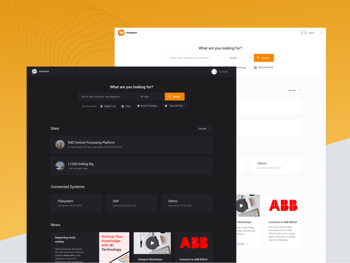
Finally,
since users were employed around the clock, a dark theme was added
to make Viewport easier on the eyes in
dark environments.
During this
project, I decided to make the switch from Sketch
& Invision to Figma and made my very first delivery on
Figma.